


When I joined Alida in 2020, the company was in the middle of an exciting transformation. Having rebranded from Vision Critical to Alida, they needed a fresh, cohesive experience across their suite of products. However, the challenge was clear:
Over time, inconsistencies had moved into the UI, and aligning everything under one unified system was not an easy task.
Products offered by the organization have some inconsistencies in their interfaces, which can confuse our users.
How might we create a unified design system that ensures a seamless, cohesive user experience while working within the constraints of the existing platform architecture?
Role
As a design lead for this project I led all design initiatives, worked with designers, product managers and developers
Deliverables
Information architecture, Design System, High-fidelity mocks

Designing the right thing
From the start, I knew that this wasn't just about aesthetics it was about usability, efficiency, and scalability. Each product had its own design challenges, and users moving between them would often encounter different interactions, layouts, and components.
To get a better grasp of the problem, I conducted an audit of all existing products. This helped pinpoint key inconsistencies in typography, spacing, button styles, and interactions. Additionally, I met with designers, developers, and product managers to understand their pain points and workflow inefficiencies, also analyzed competitor design systems for industry benchmarks.
Basically, I had to dig through the UI and figure out where things were breaking down.
Outcome:
A comprehensive report detailing design challenges, inconsistencies, and opportunities for improvement.

Mapping Out the Solution
A successful design system represents a shared language between design and development. To ensure a smooth rollout, I focused on three core principles:
1. Consistency: Establishing standardized components and patterns that can be applied across all products.
2. Scalability: Creating a flexible system that can grow with the company’s evolving needs.
3. Developer-Friendliness: Designing components that are easy to implement and maintain, thereby minimizing design debt.
At this stage, I began drafting component libraries, ensuring that we were not merely adding another layer of complexity. The goal was to keep the approach simple, clear, and practical.

Bringing the Design System to Life
Now I have gathered a lot of insights from the audit. I started by defining foundational elements such as colors, typography, spacing, and grid systems. This established the groundwork for a robust component library.
Next, I collaborated closely with developers to ensure that the components were practical and compatible with Alida’s existing architecture. We frequently iterated, testing the components in real-world scenarios to enhance usability and accessibility.
This phase was a blend of excitement and problem-solving. Some elements worked beautifully, while others required multiple revisions. But that’s the beauty of design systems, it evolves through collaboration and iteration.

Implementation & Adoption
A key part of this project was fostering alignment across teams. I led design workshops to introduce the system, gathered feedback, and ensured that designers and developers were comfortable adopting it.
To support implementation, I created thorough documentation detailing component usage, guidelines, and best practices. This helped streamline the development process and ensured consistency as new features were built.
Rolling it out wasn’t just about shipping a Figma file and calling it a day. It was about working with the developers adding components to the Devp's Storybook, making sure teams actually used the system, found it valuable, and felt empowered by it.

Design System
The design system is the result of collaborative work between members of the UX team. Following an atomic design approach, we created a system of components in Figma that combines UI elements used across all of the company’s products. Figma’s variants properties were also used to increase the components’ flexibility. The design system played a central role in redesigning the interfaces. In addition, it also accelerated the speed at which new mocks could be created for upcoming features.

Homepage
This project also provided an opportunity to redesign the platform’s homepage. As the organization’s product offerings expanded, the need for a unified landing page became clear. The new homepage enables users to easily monitor their recent activities and take immediate action, significantly reducing the number of clicks required to reach their desired tasks.
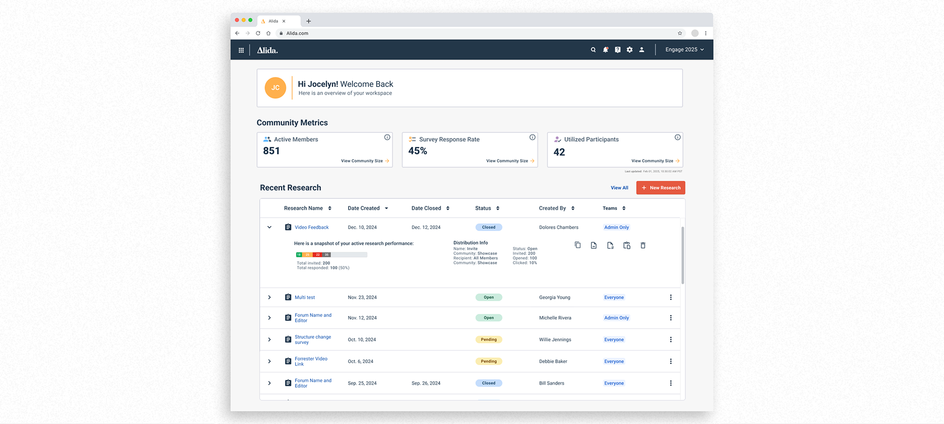
Survey
Additional features, such as the Survey Builder, were also redesigned for improved usability and visual coherence. The iconography was updated to better represent different types of survey questions and to more effectively communicate key functionalities. The updated color palette from the new brand identity was integrated into the icons to draw attention to important elements and enhance overall consistency.

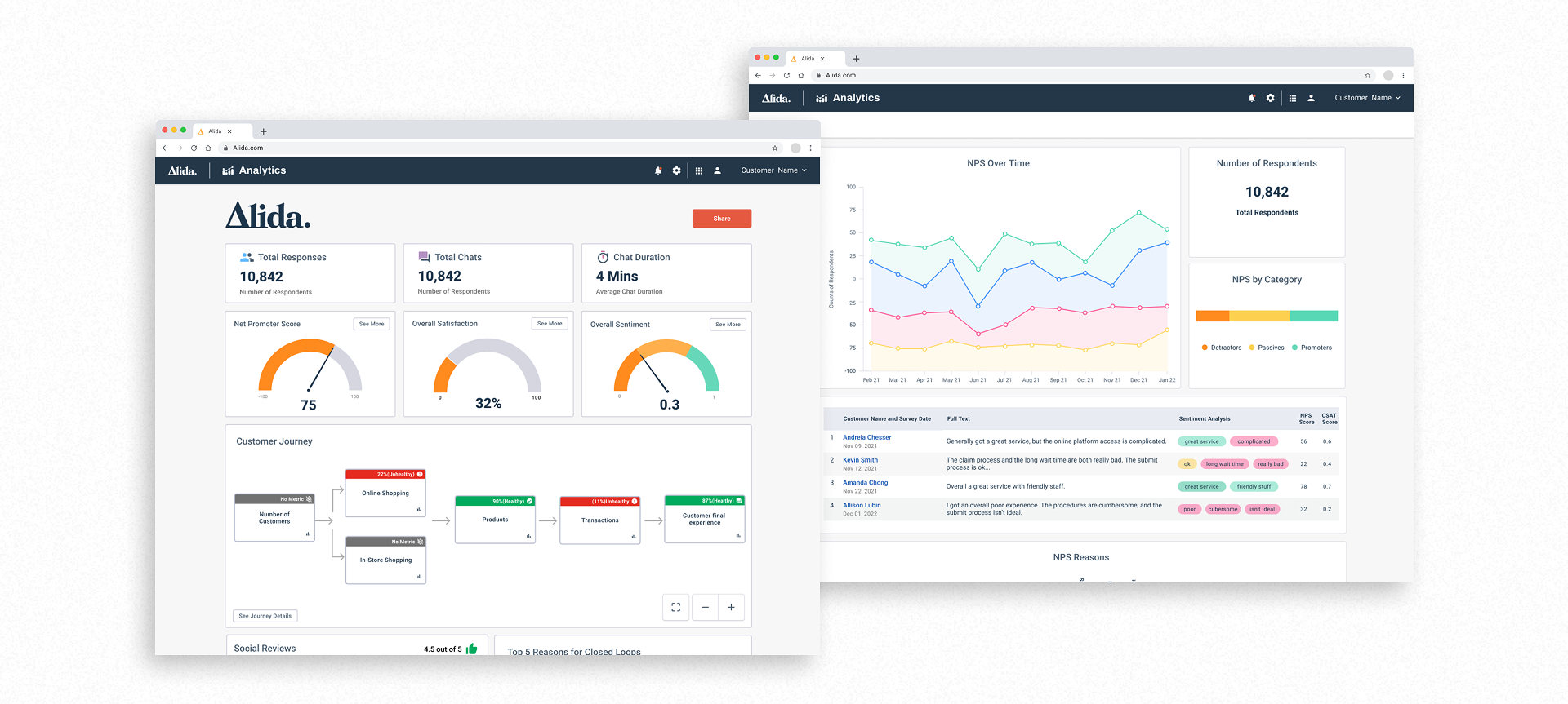
Dashboards
Colors from the new brand identity were integrated into the dashboards of products like Alida Analytics to create a more cohesive visual experience. In collaboration with the development team, various chart libraries were explored to enhance interactivity and user engagement. A key objective was to standardize the use of these libraries across all products, ensuring consistency in both functionality and appearance.
Accessibility was also a key consideration in the color integration process. Care was taken to select color combinations that meet WCAG contrast guidelines, ensuring that visual elements remain clear and legible for users with visual impairments or color vision deficiencies..
The new design system brought clarity and efficiency to Alida’s product ecosystem. Not only did it create a more cohesive user experience, but it also improved collaboration between design and development, reducing inconsistencies and speeding up the design-to-development handoff. A great design system evolves with the company’s needs.
Following the launch of the new design, I had the opportunity to visit Adobe's headquarters in Lehi, Utah. During our visit, we received enthusiastic feedback on the revamped user interface and newly introduced features. Hearing such positive recognition from a leading industry player like Adobe was both validating and inspiring, reinforcing the impact of our design decisions.

Key Performance Indicators (KPIs) Measured:
| Reduction in design debt: 30% decrease in redundant UI components.
| Faster development cycles: 40% improvement in design-to-development handoff speed.
| User satisfaction: 25% increase in usability scores from customer feedback.
| Accessibility compliance: Achieved WCAG 2.1 AA compliance, ensuring inclusivity.